How to avoid some typical mistakes when packaging your novel.
Guest Blog by John Grabowski
So many good novels are hindered by bad covers.
You would think publishers would invest a lot of time and attention to covers, especially in this age on thumbnails and on-line shopping, but it seems many don’t. And that’s professional publishers. Self-published covers tends to be even more hideous; I can almost always spot a self-published novel just from looking at the thumbnail.
Take this one…

(Incidentally, I want to stress that I am in no way passing judgment on the literary merits of the books I cite as example, most of which I have not read. They may be the greatest novels in print right now, for all I know—all the more reason great covers are crucial.)
The Competition. Beautifully done, but what does the image say? What is this book about?
There are so many elements going on, yet they add up to…what? There’s the painting inside the image, which seems to be on fire (or is it?) and then there’s a field behind it, and the painting appears to be of that field, though there’s not enough field visible to tell, and the rather small title and author lettering…and what does a painting, a fire and Georgian England have to do with a competition? What kind of competition? And how does Georgian England play into any of it? It’s both complicated and yet unable to communicate anything.
Now here’s a stunningly done professional cover by contrast…

Beautifully focused and eye-catching. Much cleaner than The Competition, with only two elements (three if you count the little decorations at the top and bottom), a simple photo and centered, balanced text.
Yeah, but again, what’s it about. It shows a house—a shack, really—in the middle of nowhere. Kind of “blind,” right?
With a little looking, the answer is, no, it’s not. The image suggests anonymity, the unsung, the lonely, in perfect keeping with the title. It’s also a period piece, a work about forgotten people (from the “dustbowl” era of the 1930s) and the sepia tone photo of the shack and the parched land works for that. The fact that the title is in lowercase letters underscores the “underdog” quality of the work. We don’t know exactly what this story is about, but we know the tone, the era, and the type of people we are going to meet. It’s enticing without giving a lot away. I don’t know about you, but it pulls me in, makes me curious.
Covers don’t have to be that stark and austere, though. Obviously an approach like that would not work for a more contemporary, upbeat novel, but the same rules apply: one clear image, simple font, clean, balanced design. Not too many elements fighting each other. Ideally your eye pops from image to title to author. The best covers are often quite simple:
Steve Martin’s Shopgirl cover is especially telling. Not only is it ridiculously simple, it’s for a novella about an older, somewhat predator man who has eyes for a, well, shop girl. The image of the girl is not only showing us everything but her face, but it’s set small into the cover, inviting us to scrutinize it, much as the male character scrutinizes her. It reflects the book’s tone and psychology, in other words. And I love the brave choice for Tiffany D. Jackson’s Allegedly. Current wisdom mandates covers feature large fonts and images so that they pop when viewed online as thumbnails; this designer went small instead, and I think it pays off by piquing your curiosity.
Unlike Shopgirl and Allegedly, many book’s covers fail because they are too generic. I understand wanting to blend in to your niche, but…

…while technically well done, looks like a hundred other books of its type. Is there anything you’ll remember about this book 30 seconds later? (Some authors, such as Sue Grafton or Dan Brown, have covers that follow a genre or “house style.” But they’ve already built a following; readers are looking for their designs the same way fast food connoisseurs look for Golden Arches or Colonel Sanders.)
Many writers who make their own covers discover the huge toybox of effects available with modern design software. Consequently, they go crazy with offset type, strokes, bevels, bleeds, strokes, and all sorts of font distortions that may look cool the first time you see them but quickly get old. Here’s one terrific example:

Wow, where to begin? There’s the cheesy, Photoshop filtered images, tinted purple (and I had to look four times before I saw the teeny-tiny oil well), the offset “3-D” font, the subheading right on the cover (the same us true of the first novel, by the way, The Competition: Do not write a subheading that “explains” the book. That’s for the back jacket or inside flap), the “by Alon Shalev.” (Don’t say your novel is “by” you. What other name would be on the cover?) There are three distinct fonts here—I won’t go into elaborate design theory, but don’t use more than two—and one is ideal (see Whose Names Are Unknown, above). If you must use two, make sure, like Simon and Garfunkel, like Sacco and Vanzetti, like Penn and Teller, that they pair well. Look up “fonts that look good together” or something such—yes, designers have made lists. And go easy on drop shadows, inner and outer glows, and other special effects. Like tasteful makeup, these should only be used if needed to enhance the natural effect, not be slopped on so that your cover is the equivalent of Tammy Faye Bakker’s face. (Google her if you’re too young.)
Basically, just as you should have a direct, simple elevator pitch, you should have a memorable visual for your cover. Even a very complicated story can be boiled down to one idea, one thought. An opus as massive as the Bible could be summed up as The story of humanity’s fall, and the road back.
To sum up: Find an image (and make sure you have usage rights or you could get into hot water) that symbolizes the essence of your story. It needn’t be literal; metaphors work great. But do avoid stock photos of clichés, like winding roads or sunsets or blue skies. Choose an image that isn’t busy, so that the text doesn’t get lost inside it, unlike this one:
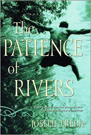
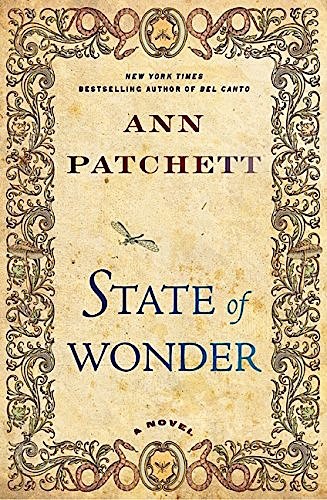
Use clean, easy fonts, no more than two and preferably one. There’s a lot you can do with one font, altering the weight (thickness), tracking (space between letters), case (upper and lower), color, and size for powerful effects. You don’t need unusual fonts to stand out either. Look at this gorgeous cover for Ann Patchett’s A State of Wonder. It looks elaborate, but it’s actually clean and controlled.
There are numerous websites that discuss these basic design principles. I’m not going to recommend links because they may change by the time you read this. Find a few, absorb their lessons, and go forth with you projects confident you will bring something bold and beautiful into the world.
_____________________________________________________________________________________________
John Grabowski is the author of Violet Rothko and Other Stories, a collection of short fiction coming in September from Millennium. His first novel, Entertaining Welsey Shaw, was praised by Kirkus Reviews for being witty, fast-paced and “filled with flirtatious banter.” AuthorJohnGrabowski.
 Then I thought – I’ve never written anything about them. And I can see why. I never want to deal with them or be around them or even think about them ever, ever again.


 Hanging out with people who are serious about their writing feeds a writer’s soul.

 Something I often hear as a counselor is clients speaking about the weight of expectations they feel they’re carrying on their shoulders; and the frustration, guilt, or resentment they feel in relation to them.
 our attention and encourage us to look to the outside of ourselves for fulfillment–creative expression of, and reflection on, our inner experience allows us to re-center and reconnect with our inner journey of transformation.
You must be logged in to post a comment.