Book Signings!
I had the unfortunate displeasure of spending time with people I’m not fond of. I am barely able to tolerate negative people. I can’t stand people who are so mired in their own sense of self importance or righteousness that they can’t see beyond their own bullshit.
I came away regretting my decision to go and feeling very nasty inside, as if a piece of my soul had been burned away. I sat with it all night, no television, no radio, nothing to drown out or distract myself from the boiling nastiness of an impression they left on me.
 Then I thought – I’ve never written anything about them. And I can see why. I never want to deal with them or be around them or even think about them ever, ever again.
But that inspired something. One woman has a big round face that appears to be growing from another face. Her husband stared at me as if he was planning the perfect recipe for my kidneys, liver, heart. “A slaw, soaked in buttermilk and vinegar.” I’m pretty sure I heard him say as he passed by.
And then the keepers of the whole chud-like crew.
I’ve been known to write some pretty dark things. People like this are the reason why.
Untitled, but begun.
I will give these soul sucking people a different life. I’m sure they won’t like – if they bother to recognize – themselves.
This will give that scent of madness, the sickly feeling of food poisoning filling my bodily cavities, some place to go and rest.
Use it, ladies and gentlemen, use all the things and people and places you don’t like to fuel your writing.
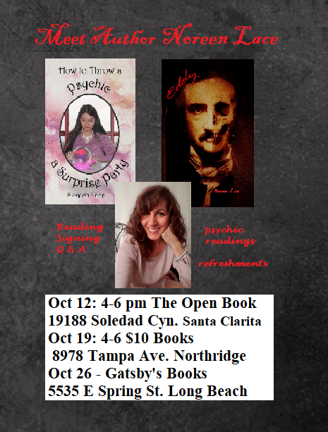
I love autumn. I love October. I love Halloween. And this October 19th at 4pm, I’ll be signing How to Throw a Psychic a Surprise Party and Eddy at the $10.00 Books in Northridge, California.
This bookstore is one of my favorites. They mix classics, used, and publisher buyouts for a unique collection of books. AND they happen to be between TWO COFFEE SHOPS! Both of which serve bomb pastries.
This book signing will feature our own psychic! She’ll be reading your fortune using the Tarot.
Plus other surprises!


More Info to follow!
I’m ashamed, truly. I don’t usually brag, but someone asked… they asked!
I once woke up with a line to a story. It was four in the a.m. and I woke up with “the day she ran over her neighbor’s dog…”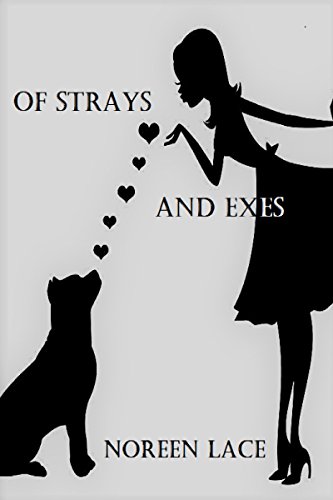
(Pet lovers – no dogs were injured in the writing of this story.)
I wrote it down, but then the story started pouring out, so I got out of bed and wrote for three hours until I had to go to work, then finished it when I returned home. Of course, that was the first draft of “Of Strays and Exes.”
A few more drafts and it was published just a few months later. Sometimes that happens.
They wowed – so I wanted to share that not all stories go that way. Another story, took YEARS. I want to say maybe six or even eight years to get right. It went through many drafts and grew.
I’m pretty damn proud of that story. Yeah, I said, it was pretty damn good.
Maybe I lost them, I don’t know. I laughed, they laughed.
See – sometimes things spill out and they are a gift from the muses; other times, things are hard and you have to work and work to get them right, and when you’re finished and it’s accepted and loved, you feel your hard work has paid off, it’s successful.
I return to my usual humble self.
How to avoid some typical mistakes when packaging your novel.
Guest Blog by John Grabowski
So many good novels are hindered by bad covers.
You would think publishers would invest a lot of time and attention to covers, especially in this age on thumbnails and on-line shopping, but it seems many don’t. And that’s professional publishers. Self-published covers tends to be even more hideous; I can almost always spot a self-published novel just from looking at the thumbnail.
Take this one…

(Incidentally, I want to stress that I am in no way passing judgment on the literary merits of the books I cite as example, most of which I have not read. They may be the greatest novels in print right now, for all I know—all the more reason great covers are crucial.)
The Competition. Beautifully done, but what does the image say? What is this book about?
There are so many elements going on, yet they add up to…what? There’s the painting inside the image, which seems to be on fire (or is it?) and then there’s a field behind it, and the painting appears to be of that field, though there’s not enough field visible to tell, and the rather small title and author lettering…and what does a painting, a fire and Georgian England have to do with a competition? What kind of competition? And how does Georgian England play into any of it? It’s both complicated and yet unable to communicate anything.
Now here’s a stunningly done professional cover by contrast…
Beautifully focused and eye-catching. Much cleaner than The Competition, with only two elements (three if you count the little decorations at the top and bottom), a simple photo and centered, balanced text.
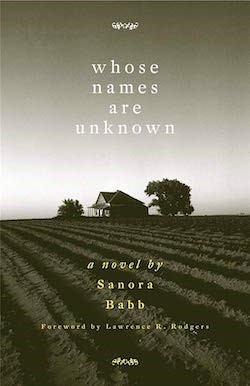
Yeah, but again, what’s it about. It shows a house—a shack, really—in the middle of nowhere. Kind of “blind,” right?
With a little looking, the answer is, no, it’s not. The image suggests anonymity, the unsung, the lonely, in perfect keeping with the title. It’s also a period piece, a work about forgotten people (from the “dustbowl” era of the 1930s) and the sepia tone photo of the shack and the parched land works for that. The fact that the title is in lowercase letters underscores the “underdog” quality of the work. We don’t know exactly what this story is about, but we know the tone, the era, and the type of people we are going to meet. It’s enticing without giving a lot away. I don’t know about you, but it pulls me in, makes me curious.
Covers don’t have to be that stark and austere, though. Obviously an approach like that would not work for a more contemporary, upbeat novel, but the same rules apply: one clear image, simple font, clean, balanced design. Not too many elements fighting each other. Ideally your eye pops from image to title to author. The best covers are often quite simple:


Steve Martin’s Shopgirl cover is especially telling. Not only is it ridiculously simple, it’s for a novella about an older, somewhat predator man who has eyes for a, well, shop girl. The image of the girl is not only showing us everything but her face, but it’s set small into the cover, inviting us to scrutinize it, much as the male character scrutinizes her. It reflects the book’s tone and psychology, in other words. And I love the brave choice for Tiffany D. Jackson’s Allegedly. Current wisdom mandates covers feature large fonts and images so that they pop when viewed online as thumbnails; this designer went small instead, and I think it pays off by piquing your curiosity.
Unlike Shopgirl and Allegedly, many book’s covers fail because they are too generic. I understand wanting to blend in to your niche, but…

…while technically well done, looks like a hundred other books of its type. Is there anything you’ll remember about this book 30 seconds later? (Some authors, such as Sue Grafton or Dan Brown, have covers that follow a genre or “house style.” But they’ve already built a following; readers are looking for their designs the same way fast food connoisseurs look for Golden Arches or Colonel Sanders.)
Many writers who make their own covers discover the huge toybox of effects available with modern design software. Consequently, they go crazy with offset type, strokes, bevels, bleeds, strokes, and all sorts of font distortions that may look cool the first time you see them but quickly get old. Here’s one terrific example:
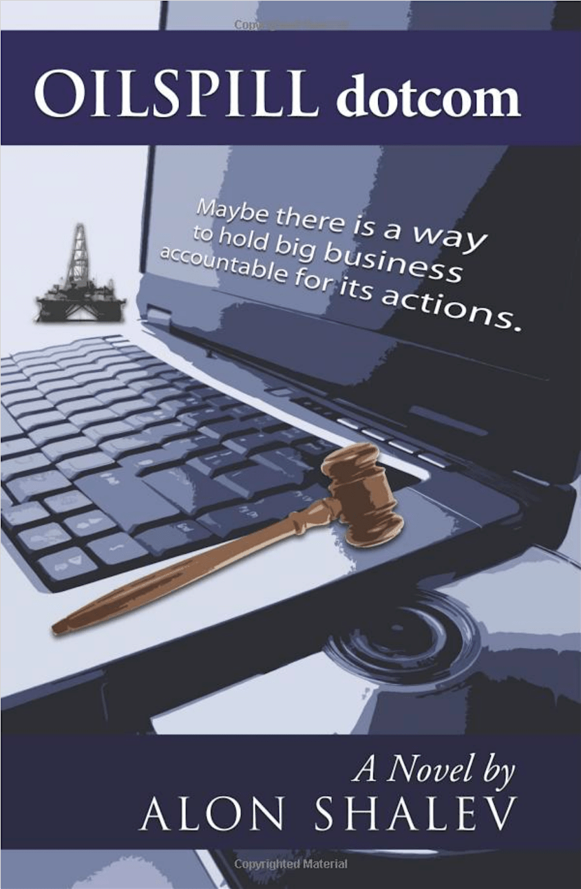
Wow, where to begin? There’s the cheesy, Photoshop filtered images, tinted purple (and I had to look four times before I saw the teeny-tiny oil well), the offset “3-D” font, the subheading right on the cover (the same us true of the first novel, by the way, The Competition: Do not write a subheading that “explains” the book. That’s for the back jacket or inside flap), the “by Alon Shalev.” (Don’t say your novel is “by” you. What other name would be on the cover?) There are three distinct fonts here—I won’t go into elaborate design theory, but don’t use more than two—and one is ideal (see Whose Names Are Unknown, above). If you must use two, make sure, like Simon and Garfunkel, like Sacco and Vanzetti, like Penn and Teller, that they pair well. Look up “fonts that look good together” or something such—yes, designers have made lists. And go easy on drop shadows, inner and outer glows, and other special effects. Like tasteful makeup, these should only be used if needed to enhance the natural effect, not be slopped on so that your cover is the equivalent of Tammy Faye Bakker’s face. (Google her if you’re too young.)
Basically, just as you should have a direct, simple elevator pitch, you should have a memorable visual for your cover. Even a very complicated story can be boiled down to one idea, one thought. An opus as massive as the Bible could be summed up as The story of humanity’s fall, and the road back.
To sum up: Find an image (and make sure you have usage rights or you could get into hot water) that symbolizes the essence of your story. It needn’t be literal; metaphors work great. But do avoid stock photos of clichés, like winding roads or sunsets or blue skies. Choose an image that isn’t busy, so that the text doesn’t get lost inside it, unlike this one:
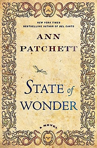
Use clean, easy fonts, no more than two and preferably one. There’s a lot you can do with one font, altering the weight (thickness), tracking (space between letters), case (upper and lower), color, and size for powerful effects. You don’t need unusual fonts to stand out either. Look at this gorgeous cover for Ann Patchett’s A State of Wonder. It looks elaborate, but it’s actually clean and controlled.
There are numerous websites that discuss these basic design principles. I’m not going to recommend links because they may change by the time you read this. Find a few, absorb their lessons, and go forth with you projects confident you will bring something bold and beautiful into the world.
_____________________________________________________________________________________________
John Grabowski is the author of Violet Rothko and Other Stories, a collection of short fiction coming in September from Millennium. His first novel, Entertaining Welsey Shaw, was praised by Kirkus Reviews for being witty, fast-paced and “filled with flirtatious banter.” AuthorJohnGrabowski.

I heard from a woman who asked me to share a story with young people. The story was my own, The Healer’s Daughter, from How to Throw a Psychic a Surprise Party.
She said the story was valuable and every young person who has ever bullied or been bullied needs to read it.
Bullying is a part of the story, and for the little girl in the story, it’s a very big part – as it was for any and all of us who were on the wrong side of the mean kids.
She felt, I believe, it would also help bullies to gain some sort of understanding. Maybe, maybe not. But I appreciated her feedback on what some people feel is a minor part of the story.
I appreciate the feedback and that my story touched her so much she feels the need to share it.
Much appreciated.
Our stories have power. And they have unintended consequences. I’m happy that mine leaned toward positive.

Something happens after a book is published. Writers, then, have a dual focus. Trying to promote and continuing to work on their next project. This leaves me, personally, overwhelmed. And I don’t function well in that place.
Some authors speak of a “let down” time after their novel or book is published. That they feel depressed, blue, unable to work.
I wonder if it’s something like postpartum depression. You’ve worked so hard and birthed this marvelous creation, and you’re somewhat exhausted and now have so much to take care of.
Writers do refer to their writing as offspring in some sense or another.
The thing about procrastination is that it becomes a habit.
When I’m overwhelmed and don’t know what to do first, I tend to procrastinate. We’re not just talking about a lot to do. I regularly have a lot to do and have it scheduled, done, and still have writing time.
I think scheduling helps overcome or even usurp any potential procrastination. So it’s summer, no schedule, makes it even harder.
I got a schedule book, instead of just my phone, and keep that on the table I pass most often in the house. There it is, laying open, telling me what needs to be done and by what time. No phone beep that I tend to ignore or swipe to dismiss, but an open book written in pen and ink.
I’m old school. An open book is my catnip.
I’m a tad neurotic. A to-do list is my medicine.
Take that procrastination!
 I’ve been worked over by a story all summer. I feel like we’ve been beating each other up and down and neither of us is winning.
At this point, I hate this story. But, no, not true. I love it. I love the characters and want them to have a voice, a say in their life.
But, gosh darn it – speak!
Maybe I have not been giving the story it’s due, it’s time. The main character, Bella, came simply enough and her father did too. This is the primary relationship and the source of conflict in the story, but then there are a whole bunch of secrets. Aren’t there always?
I wrote the first draft and showed it to my writing partner who said the story had merit and I should keep at it. So, here I am, months later, keeping at it! Frustrated.
Writers understand this. Sometimes stories do this to us. The story wants/needs to be told, but it’s so hard in coming.
I need to do it. I need to force it. I need – I don’t know. Maybe it’s the story’s needs I should think about. It needs some time maybe, more thought; it needs to be brought to life for whatever reason it was given to me to write.


You must be logged in to post a comment.